-
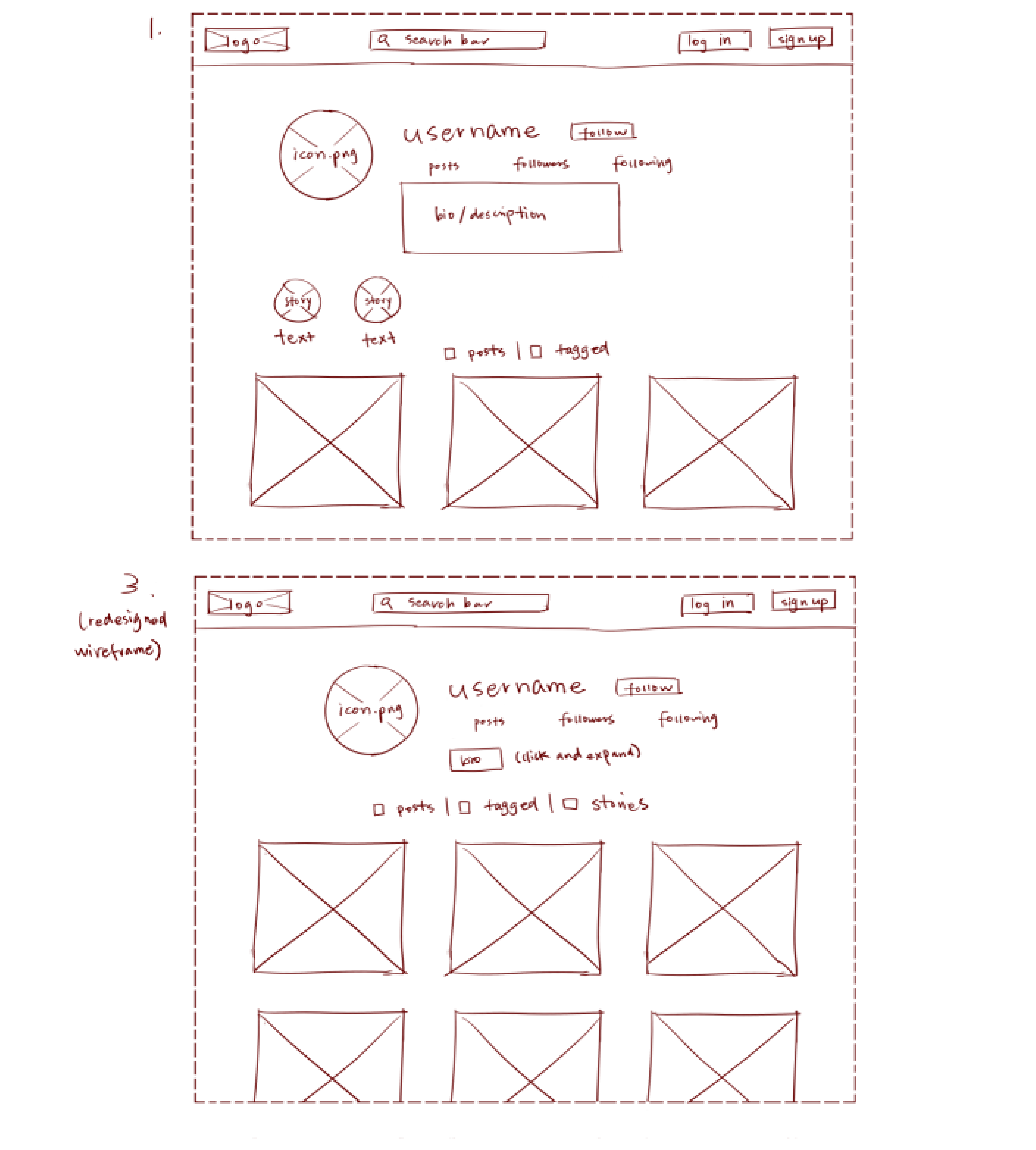
Using the favorite website you chose in homework 1, create a wireframe for one page of it using pen/paper, PowerPoint, or any your tool of choice. (use the 'img' tag!) Make sure to let us know what the name of your website is (Use the 'p' tag!)

-
Try to improve the website you've chosen, and create a redesigned wireframe of one page for the same website using the principles of visual hierarchy that you learned from the article.

-
What is the goal of the website? Who is it intended for? How does the design accomplish this? Write 2-3 sentences answering these questions. (Use the 'p' tag again!)
The website is a suicide prevention and crisis intervention center for LGBTQ+ youth. The page being wireframed is the project's resource page, which provides useful written articles concerning gender and sex, organized with content tags. In addition, due to the vulnerability of its target population, the website allows users to surreptitiously exit out of it by pressing the escape key three times.
-
Write 2-3 sentences about what problems your redesign addressed, and how it solved them.
I felt the tagging system's potential wasn't maximized. Clicking on the individual tags under the search bar simply redirected you to a page with only articles under that tag, whereas I felt that a multi-tagging filter system would work better. I also took minor issue with the redundancy of the two navigation bars on top; it wasn't immediately clear, for example, what the difference between "Find Support" and "Get Help" was. In my redesign, I streamlined this into one row.
NOTE: Make sure to include the wireframe images in the website and don't just put it in your assets folder!
Your wireframes should look something like this:
